Race to the Rings
For the yearly 2024 wellness challenge, the theme was the Olympics to go along with the Games happening that year, highlighting team-work, the importance of movement during daily life and reminding employees that exercise is different for each individual.
Skills
Concept DesignTools
Adobe Illustrator
Adobe Indesign
Adobe Photoshop
REASEARCH AND MOODBOARD
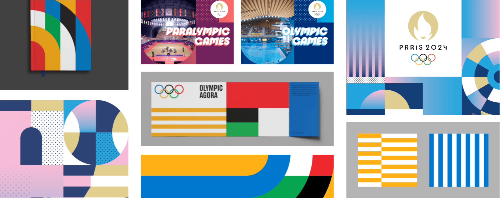
The first phase is to look for inspiration, luckily the Olympics and the Paris 2024 visual identity was really inspiring and worked as a jumping point for the feel of the Challenge’s visual feel.
SCAMPING AND FIRST APPROACH
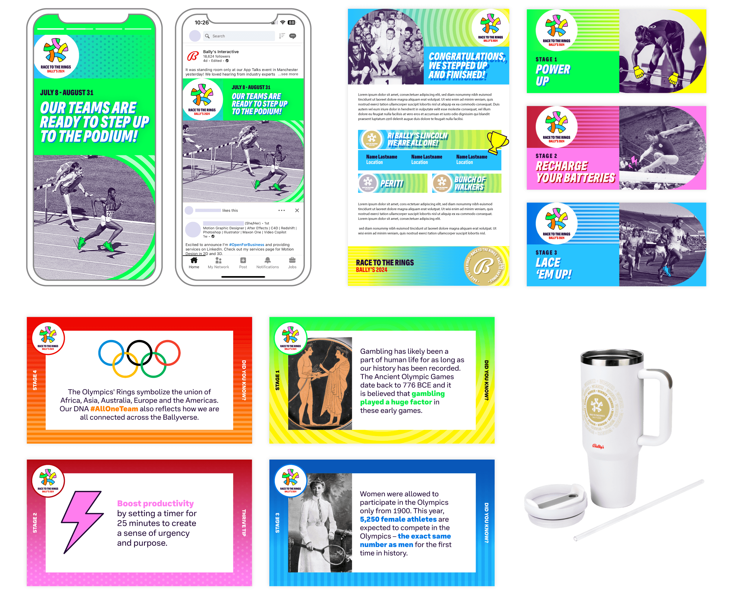
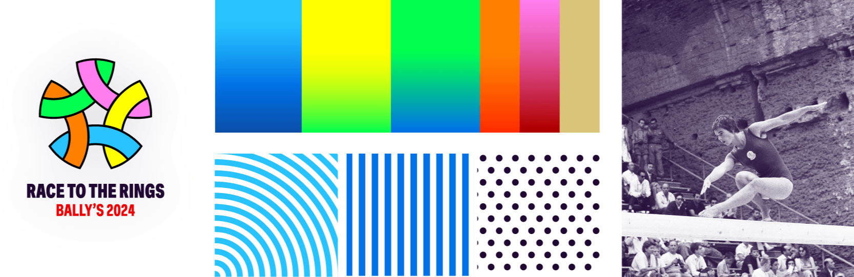
Inspired by the name of the challenge ‘Race to the Rings’ and on the five rings that represent the five continents, but keeping in mind to make it different enough from the official logo and is encapsulated into a red shape to evoke an olympic medal. For colours, starting from the wellness palette a set of gradients were created plus one extra ‘golden’ colour to be used on the logo like a gold medal, also, a set of patterns were added to the toolkit of this event to have several elements to play with to create all assets, finally, for imaginary, archive images on public domain with dual-tone colour and intervened with icons to make the photos more playful.
SCAMPING AND FIRST APPROACH
The brand was mainly used for internal comms; from update emails to internal screens with information about the Olympics, plus some assets were designed for LinkedIn and Instagram and, finally, physical prizes for the challenge winners, this year was a trendy thermal cup with the golden logo printed into it.